NO 1. THE DARK KNIGHT
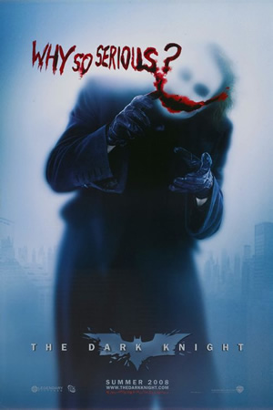
Can we ever forget the chilling smatter on the wall of The Dark Knight’s emblem? Or the imposing figure of The Joker against raining bits of destruction? Whether is it the diabolical images of the Joker or the brooding ones of The Dark Knight himself, they helped stoke a fever of anticipation for what is probably the finest movie of 2008. Truly, Heath Ledger would have been proud.
NO 2. THE SPIRIT
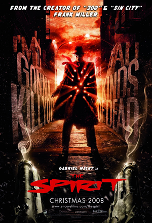
Never mind that they were somewhat reminiscent of the look and feel of Sin City. The triptych featuring The Spirit in a bright red tie silhouetted against gleaming white flakes of snow- with the iconic words from the comic book “My city screams. She is my lover. And I am her spirit.”- screamed cool in the most distinctive Frank Miller way.
NO 3. BURN AFTER READING
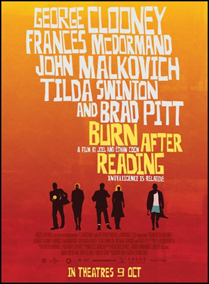
Acclaimed American graphic designer Saul Bass would have been proud of the proudly retro style on display here. A nice tip of the hat to Bass’s iconic Vertigo (1958) and Anatomy of a Murder (1958) designs.
NO 4. CLOVERFIELD
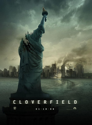
How do you sell a monster movie without giving anything away? Take New York’s most prominent landmark and obliterate it. That’s exactly what Cloverfield did. Now tell me if the first sight of the Statue of Liberty with its head missing did not immediately send chills down your spine?
NO 5. SPEED RACER
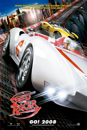
Hands down the most colourfully irresistible poster of the year! The Wachowski Brothers’ big-budget live-action remake of the 1960s cartoon series was made for the young and the young-at-heart. And every one of its posters was a befitting statement of the signature psychedelic, candy-coloured world that could have only come straight out of the Wachowskis’ visual imaginings.
|
NO 6. YES MAN
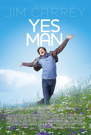
It’s been a while since Jim Carrey did comedy but if the posters are anything to go by, he has definitely returned. In both his Sound Of Music lookalike teaser and ‘I did it myself’ bungee jumping official poster, Carrey uses his physically expressive face to great effect. Yes! Jim Carrey is back!
NO 7. AUSTRALIA
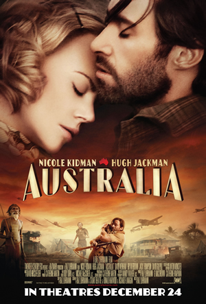
There was a time when Hollywood used to make great wartime epics like Gone with the Wind or Casablanca. Those days are sadly (well) gone like the wind. But Baz Luhrmann’s Australia promises to take us back to the grand old days of cinema and its beautiful majestic poster says it all.
NO 8. BLINDNESS
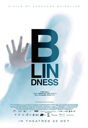
Think of blindness and one would almost immediately associate it with darkness. Instead, each of Blindness’ posters was bleached with the same overexposed look that efficiently captured the unusual state of ‘white blindness’ in Fernando Meirelles’ tale. What’s more, the play on the layout of the movie’s title in the teaser (as an eyesight test) was simply ingenious.
NO 9. ACCURACY OF DEATH
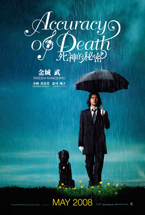
For some, the sight of Takeshi Kaneshiro face to face is to die for. For others, having Takeshi Kaneshiro as the Grim Reaper is probably the most you could wish for to take you away. Nonetheless, we all hope that when death comes, it will be at least as serene and tranquil as Takeshi Kaneshiro in a suit standing in the rain with an umbrella waiting. Indeed, death never looked so good.
NO 10. WALL.E
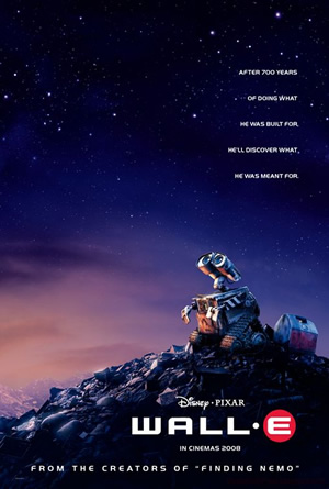
Give the folks at Pixar anything and you can be assured that they have the means to make it cute and endearing? (Have we forgotten Ratatouille is a rat?) This year, they did it with a small waste collecting robot abbreviated Wall E. Against a deep blue sky, or the infiniteness of the galaxy, the posters of Wall E succinctly convey what it feels like to be one man (or robot) in this world.
|